Pricing is more than just numbers; it’s an intricate blend of psychology and design. In this blog, we will explore how various elements such as color, quantity, and layout can significantly influence consumer perception and decision-making when it comes to pricing plans.
The Complexity of Pricing Perception
Understanding pricing perception involves grappling with various psychological factors that influence how consumers view and react to prices. Price isn't merely a numeric value; it is a complex signal that carries emotional weight. Factors like visual presentation, the context of the pricing, and even the language used can greatly affect how a price is perceived.
For example, a price presented as $49.99 often feels significantly cheaper than $50, despite the minimal difference. This is known as the charm price effect, where the leftmost digit is altered to create a perception of a better deal. Pricing strategies must account for these psychological nuances to effectively influence consumer behavior.
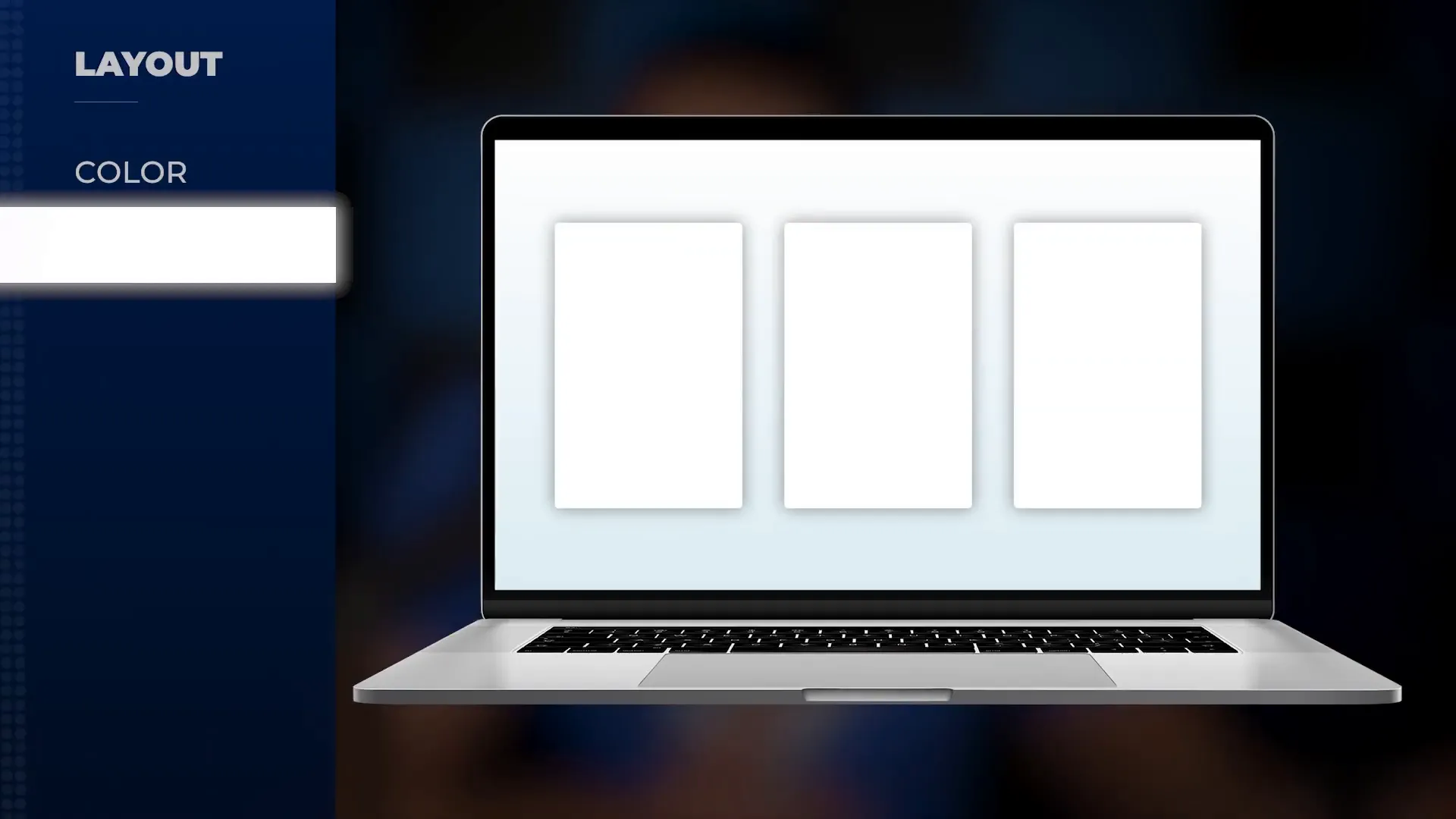
Color Psychology in Pricing
Colors used in pricing can evoke specific emotions and perceptions. For instance, blue often conveys trust and stability, while red can create urgency or excitement. When designing a pricing page, it’s crucial to choose colors that align with your brand’s message and the emotional response you want to elicit from potential buyers.
Light colors can make prices feel lighter and more approachable. A clean design featuring ample white space can enhance the perception of value. Conversely, dark colors may give the impression of a premium product but can also feel heavy and less inviting.
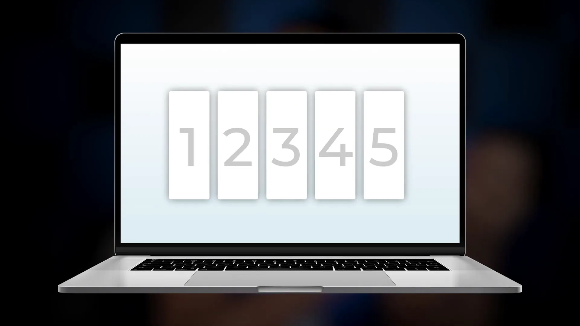
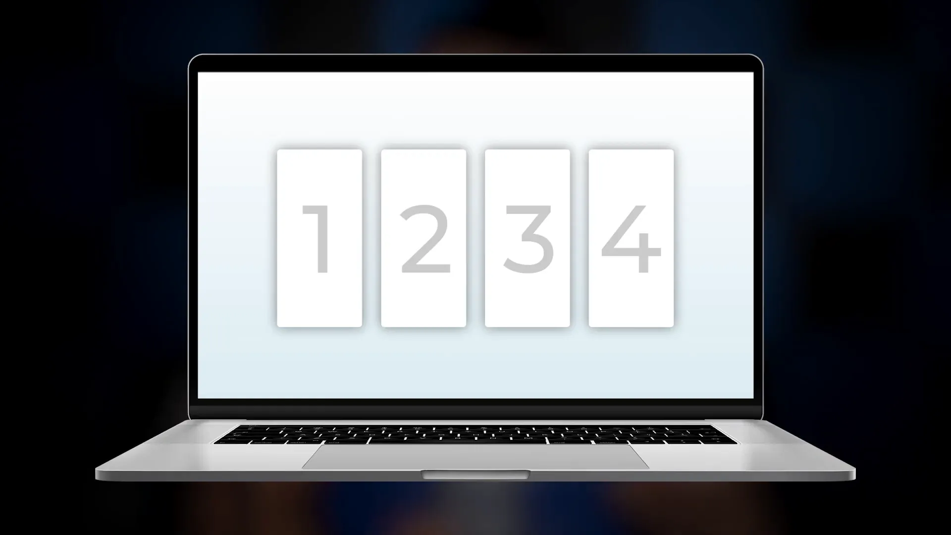
Optimal Quantity of Pricing Options
When it comes to pricing plans, less is often more. Research suggests that displaying three to four options is ideal. This aligns with the principle of cognitive load; our brains can effectively process a limited number of choices. Presenting too many options can overwhelm consumers, leading to decision paralysis.
By limiting choices, you facilitate easier comparisons among the pricing plans. Each plan should be distinct enough to highlight its unique benefits while still allowing for straightforward decision-making.
Strategic Location of Pricing Plans
The placement of pricing plans on a page can significantly impact user engagement. Positioning them near the top ensures that customers see the pricing immediately upon loading the page. If users don’t see prices right away, it can create a jarring experience, leading them to question whether they are on the correct page.
Centering the pricing plans makes comparisons easier. The central fixation bias suggests that when options are placed in the middle, they become more visually accessible, enhancing user experience.
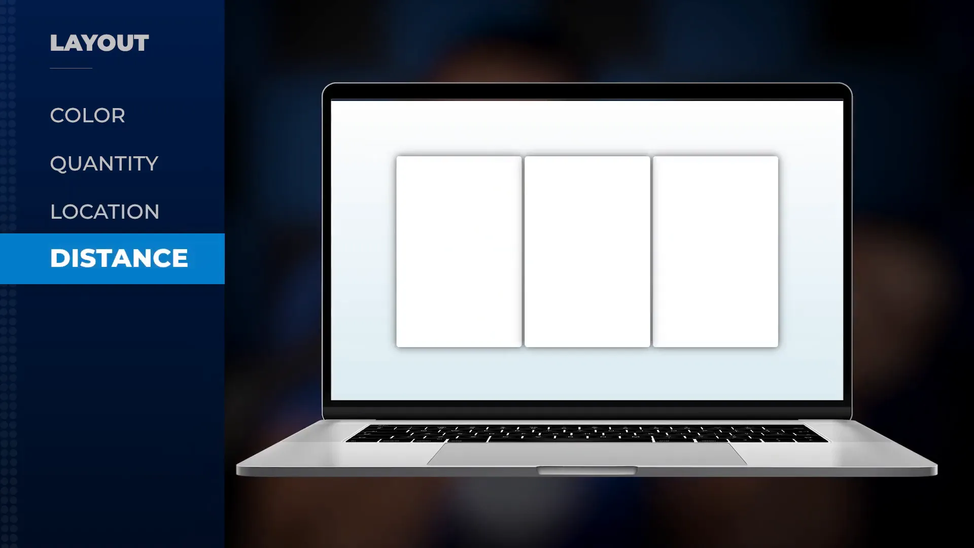
The Importance of Distance Between Plans
Proximity matters in pricing layouts. When plans are visually close together, they can be perceived as part of a cohesive unit. This can lead customers to believe that they are receiving benefits from all options. However, care must be taken to ensure that the cheapest option doesn’t feel too similar to the most expensive, as this could discourage users from selecting higher-priced plans.
Additionally, creating a sense of physical closeness between the pricing plans and the user can enhance the desire to choose. Subtle background elements can make the plans feel more integrated into the user’s decision-making space.
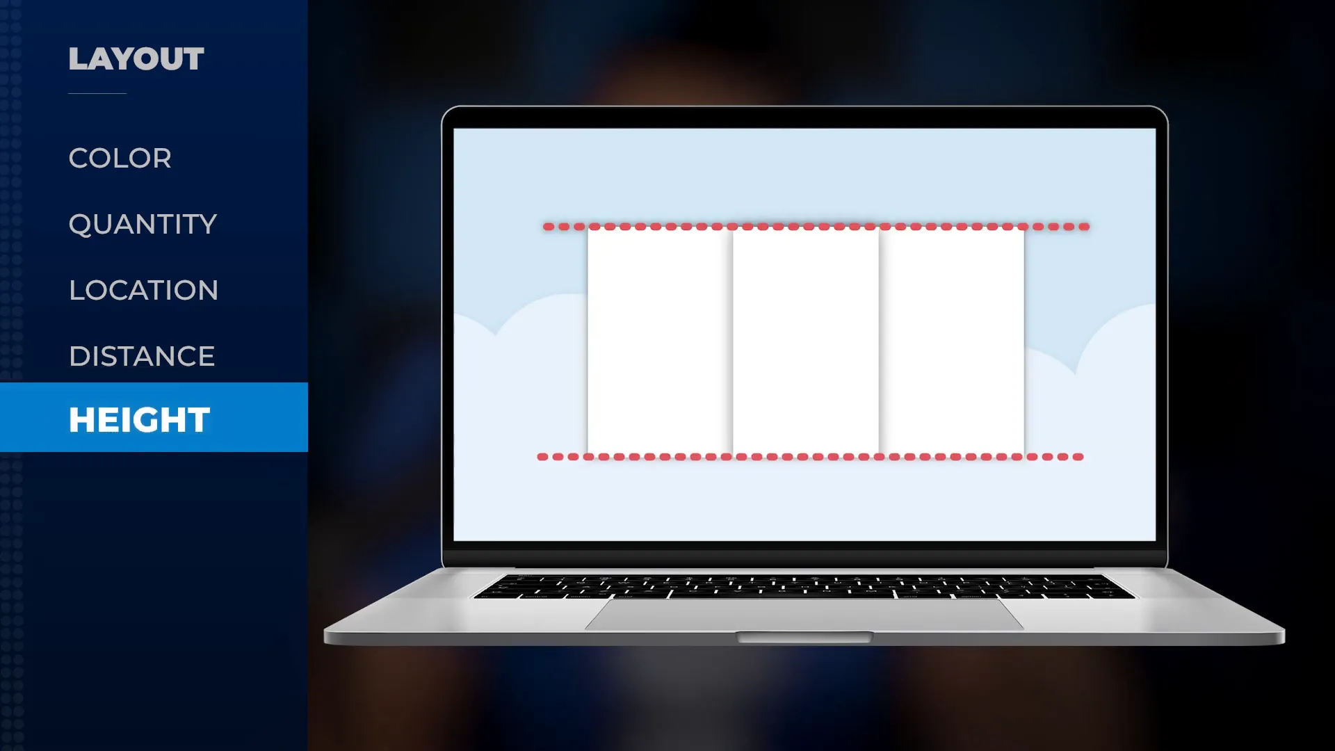
Height Consistency for Comparison
Maintaining consistent heights across pricing plans facilitates better comparisons. When plans vary in height, it can distract users from the intrinsic differences in features and pricing. A uniform height allows customers to focus solely on the differences in value offered by each plan.
This is akin to visual perception exercises where consistency in dimensions aids quicker recognition and decision-making. By standardizing heights, you streamline the comparison process, making it easier for users to evaluate their options.
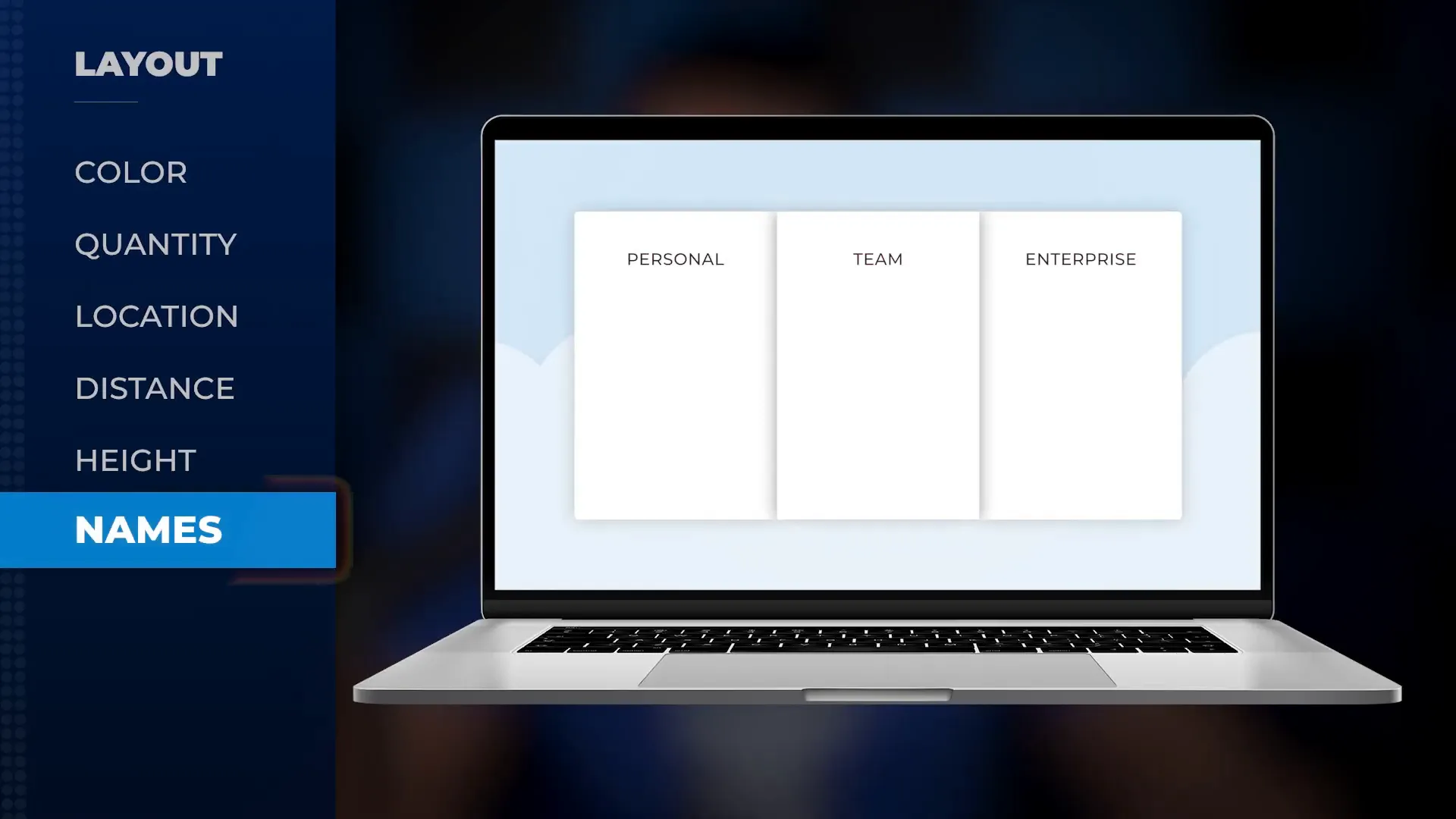
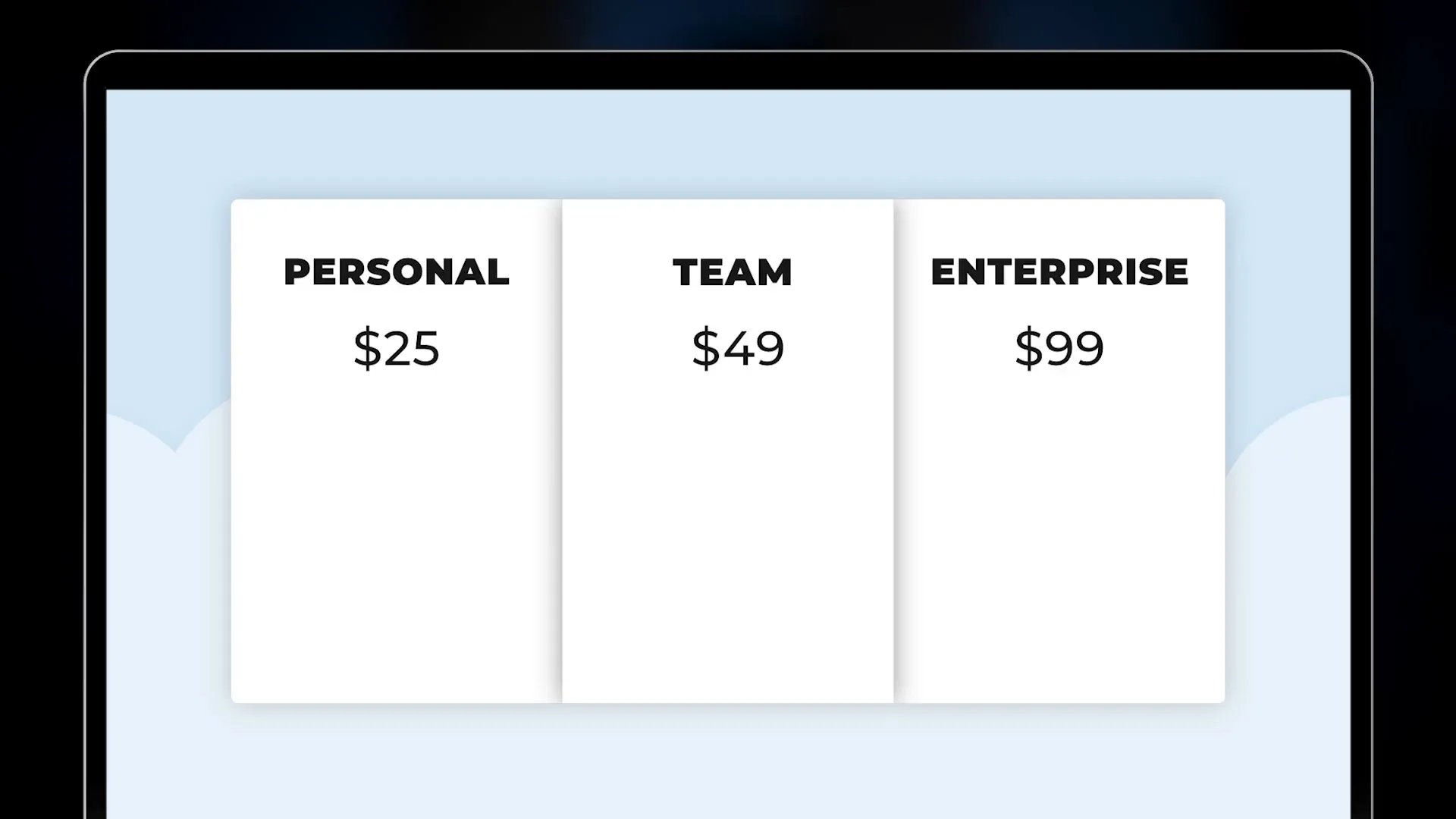
Naming Conventions for Pricing Plans
The names of your pricing plans should be clear and descriptive. Using bold, enlarged fonts for plan names draws attention to what users are receiving, rather than focusing solely on the price. This strategy shifts the focus from cost to value, which can be more appealing to potential customers.
Consider using names that evoke specific benefits or features. For example, instead of just “Basic,” you might use “Starter Package” to imply a foundational offering that supports growth. This helps customers better understand what they can expect from each plan.
The Sequence of Pricing Presentation
The order in which pricing plans are presented can influence perceived value. Presenting the most expensive option first sets a higher reference price, making subsequent options appear more affordable. This strategy utilizes anchoring, a cognitive bias where the first piece of information presented serves as a reference point for evaluating subsequent information.
Moreover, if your pricing page is structured to read from left to right, ensure that this sequence reflects the increasing value or features of the plans. This alignment with natural reading habits can enhance user comprehension and decision-making.
Designing Effective Call-to-Action Buttons
Call-to-action (CTA) buttons play a crucial role in guiding users toward making a purchase. They should be designed to stand out while seamlessly integrating with the overall pricing layout. The button's size, shape, and placement can significantly influence its effectiveness.
Opt for a larger button that draws attention without overwhelming the pricing plans. Rounded edges tend to feel more inviting compared to sharp corners, which can create a sense of rigidity. Ensure that the button's color contrasts well with the surrounding elements, enhancing visibility.
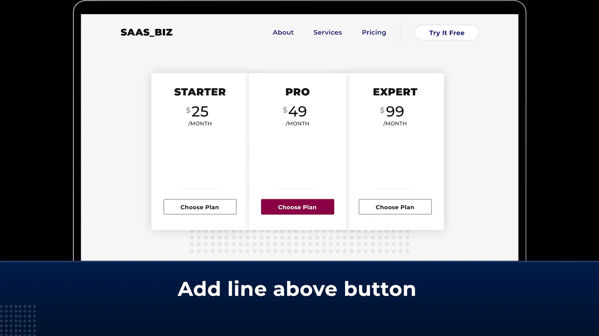
Placement Strategies for CTAs
Position CTA buttons below pricing plans to maintain a logical flow. This placement allows users to absorb all the information before making a decision. Additionally, consider placing a thin line or subtle graphic above the button to isolate it from the pricing details, drawing focus to the action you want users to take.
Experiment with placement options to see what resonates best with your audience. A/B testing can provide valuable insights into which placements yield higher conversion rates.
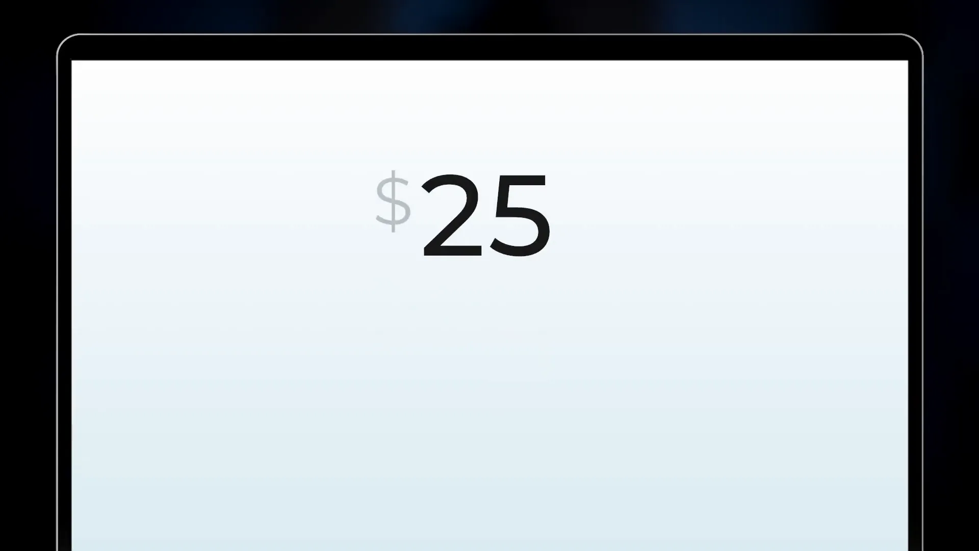
Choosing the Right Digits for Pricing
The choice of digits in your pricing can evoke different perceptions and emotions. Round numbers tend to work well for emotional purchases, while precise numbers are more effective for rational decisions. For pricing pages, charm pricing—where prices end in .99—can create a perception of a better deal.
When selecting digits, consider your target audience's mindset. For example, if your product is associated with luxury, using whole numbers may convey a sense of exclusivity.
The Impact of Odd vs. Even Numbers
Odd numbers can create a sense of urgency, while even numbers tend to feel more stable. Depending on your pricing strategy, you might choose to utilize odd numbers for limited-time offers or promotions, making them feel more appealing and time-sensitive.
Additionally, consider the syllable count of the digits. Prices that are easier to pronounce tend to be more memorable, aiding in recall when customers are making their purchasing decisions.
Visual Size and Its Impact on Pricing
The visual size of your pricing can greatly influence perceptions of value. Larger font sizes can make prices appear more significant, while smaller sizes can suggest lower value. When designing your pricing page, be mindful of how visual size relates to perceived value.
If your prices are competitive, consider visually enlarging them to highlight their attractiveness. Conversely, if your prices are not as competitive, de-emphasizing their size can help mitigate the perception of higher costs.
Creating Visual Hierarchy
Utilize typography to create a visual hierarchy within your pricing page. The most important elements, like the product name and price, should be the most prominent. Secondary details, such as features or descriptions, can be smaller and less emphasized.
By establishing a clear hierarchy, you help guide users' attention to the most critical information, making their decision-making process smoother and more intuitive.
Billing Duration Placement
When displaying billing durations, it’s crucial to position this information effectively. Ideally, place billing durations below the price to isolate the digits, allowing users to focus solely on the price itself without cognitive overload.
This layout facilitates easier comparisons between plans, as users can evaluate the core pricing numbers without the distraction of additional information or symbols.
Highlighting Billing Options
Consider highlighting different billing options, such as monthly vs. yearly, to guide users in making an informed choice. You can use different colors or styles to differentiate between options clearly. This visual distinction helps users quickly assess which option aligns best with their needs.
Using Colors and Discounts to Enhance Appeal
Color plays a significant role in pricing psychology. For example, using red for discounts can create a sense of urgency and encourage immediate action. Incorporate contrasting colors to highlight discounts or special offers, making them pop against the overall pricing scheme.
When showcasing discounts, ensure they are visually larger than the original price to emphasize the savings. A crossed-out original price above the discounted price can effectively communicate value and encourage purchases.
Effective Use of Visual Contrast
Utilizing visual contrast can help draw attention to key pricing elements. For instance, a bright, bold color for the discount price against a muted background can enhance its appeal. This technique leverages the concept of contrast fluency, where distinct differences make information more memorable and impactful.
Summary of Effective Pricing Strategies
In summary, designing an effective pricing page requires careful consideration of various elements. From strategic placement of pricing options and CTAs to the choice of digits and visual size, each factor plays a crucial role in shaping customer perception.
By following best practices such as limiting options, utilizing charm pricing, and emphasizing discounts, you can create a pricing page that not only attracts attention but also drives conversions.
FAQ: Common Questions about Pricing Psychology
What is charm pricing and why does it work?
Charm pricing refers to setting prices just below a round number, such as $49.99 instead of $50. This strategy works because consumers tend to focus on the leftmost digit, perceiving the price as significantly lower.
How many pricing options should I display?
It’s generally recommended to display three to four pricing options. This helps prevent decision paralysis and allows for easier comparisons among plans.
What colors are best for pricing pages?
Light colors and ample white space can make prices appear lighter and more approachable. Using contrasting colors for discounts can also enhance visibility and urgency.
Should I use odd or even numbers for pricing?
Odd numbers can create a sense of urgency, while even numbers tend to convey stability. The choice depends on your product and the emotional response you wish to evoke.
How can I enhance the appeal of my pricing page?
Incorporate clear CTAs, utilize visual hierarchy, and emphasize discounts. Testing different layouts and designs can also help identify what resonates best with your audience.
Download The Psychology Of Pricing
Which digits? How high? Best layout? A checklist of pricing tactics.
Download Now


